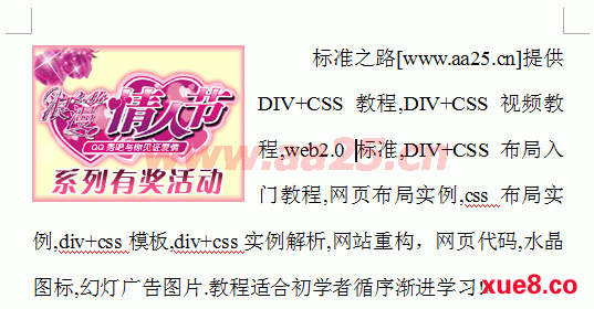
想必大家都用过word排过版,当中有个图文混排功能,如下图:
这个功能非常类似于css中的浮动,下面我们用css来实现这一功能:
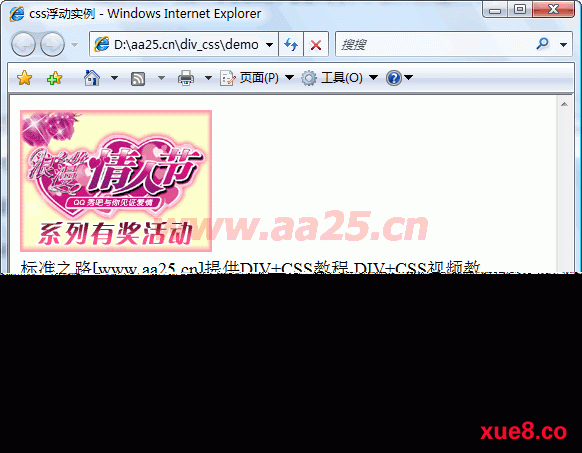
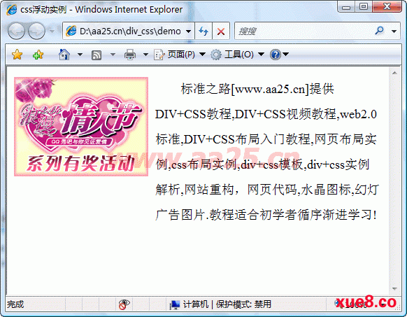
<div id="side"><img src="http://www.aa25.cn/uploadfile/taobao0903/20090212165039036721.gif" width="192" height="142" /></div>
<div id="main"> 标准之路[www.aa25.cn]提供DIV+CSS教程,DIV+CSS视频教程,web2.0标准,DIV+CSS布局入门教程,网页布局实例,css布局实例,div+css模板,div+css实例解析,网站重构,网页代码,水晶图标,幻灯广告图片.教程适合初学者循序渐进学习!</div>
创建完以上代码后,在浏览器中预览会显示如下结果:
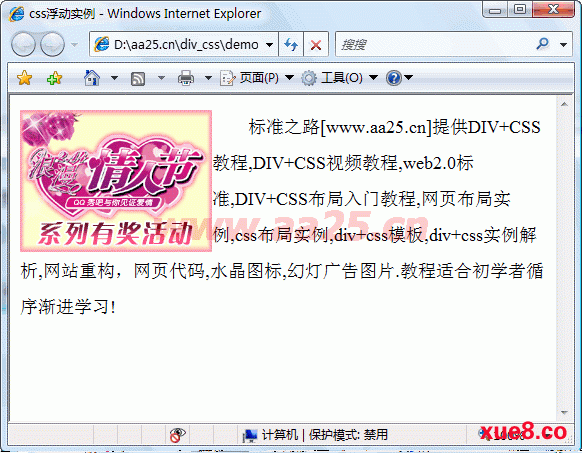
下面用css让side浮动,再看看效果
body { font-size:18px; line-height:200%; }
#side { float:left;}
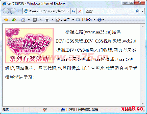
大家看看,是不是和word的效果已经很像相了,但这里的文字和图片右侧贴的很近,怎么办呢?刚才已经说了,当元素浮动过之后,需要指定一个宽度,否则它会尽可能窄。那么把side的宽度设置为大于图片的宽度,它们中间应该就有空隙了。图片的宽度是192px,设置side为202px,中间将会有10px的空隙了。
body { font-size:18px; line-height:200%; }
#side { float:left; width:202px;}
细心的朋友已经发现,上例中#main的div还定义了margin-left:120px;而这里没有定义,但它多出的文字却跑到了图片(#side)的下方,是不是设置margin-left:后,它就不会跑到#side的正文呢?如果你能想到这一点,你的确是太聪明了,事实确实是这样,在css样式表中加上下面一行
#main { margin-left:202px;}
这就是如何应用浮动实现两列布局的原理。那么三列呢?
六、三列自适应宽度
三列自适应宽度,一般常用的结构是左列和右列固定,中间列根据浏览器宽度自适应。下面在二列自适应宽度基础上修改一下
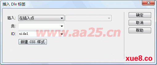
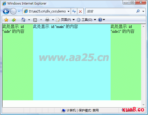
<div id="side">此处显示 id "side" 的内容</div>
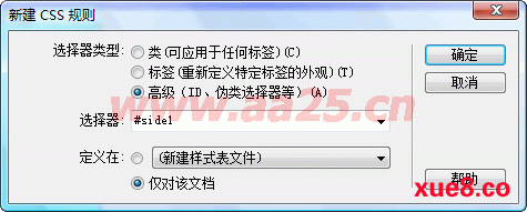
<div id="side1">此处显示 id "side1" 的内容</div>
<div id="main">此处显示 id "main" 的内容</div>
增加以下css样式:
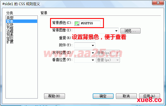
#side1 { background: #99FF99; height: 300px; width: 120px; float: right; }
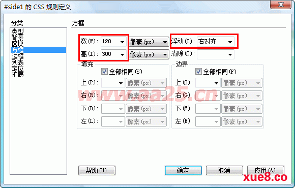
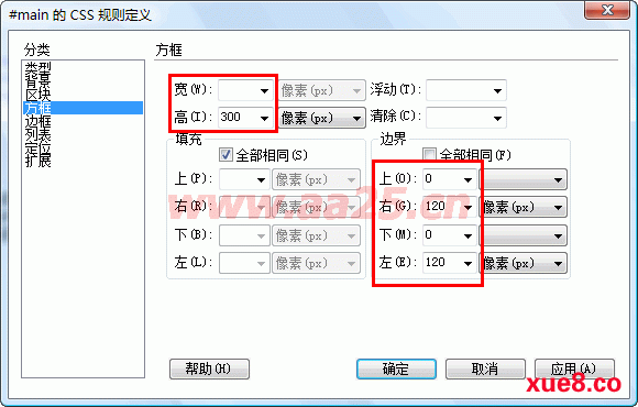
把原来#main样式的width:70%去掉,然后设置左右外边距各120px,让出左右列的宽度
#main { background: #99FFFF; height: 300px; margin:0 120px; }
预览一下效果如下:
|


 教程巴巴 版权所有